Making Stock Data Approachable

Previous VI App
The original ticker module in the app was powerful but intimidating. Designed with experienced investors in mind, it presented users with a dense mix of technical charts, ratios, and terminology that left younger or newer investors feeling overwhelmed.
User feedback revealed three core issues:
• Low accessibility due to jargon-heavy design and unclear navigation
• Lack of contextual education for stock metrics and company data
• Perceived complexity, leading users to believe the app was “not for them”
This created a significant barrier to engagement for our broader audience, particularly those just beginning their investment journey.
Our goal was to redesign the ticker module into a more inclusive, interactive, and educational experience, one that helps users explore, understand, and talk about stocks with ease.

Research & User Insights
To guide the redesign, we conducted structured user reviews and usability testing across newer investors and casual finance explorers.
Key findings:
• Users preferred point-form explanations, visual comparisons, and peer opinions over traditional financial presentations.
• Many expressed interest in learning while browsing, asking for inline guides, fun facts, and real-world analogies.
• Users wanted content that felt more personal, relatable, and shareable, something they could use in conversation with friends.
These insights informed our approach to make the experience feel more like a story about the company, not a finance terminal.
Solution: A Guided, Contextual Ticker Experience
The revamped ticker module reimagines stock discovery as an engaging, mobile-first experience structured around exploration, personalization, and conversation.
Key Feature Areas:
First Impressions
When users arrive via search or homepage suggestions, they’re greeted with company visuals, videos, and “Did You Know?” facts to quickly spark interest and build context.

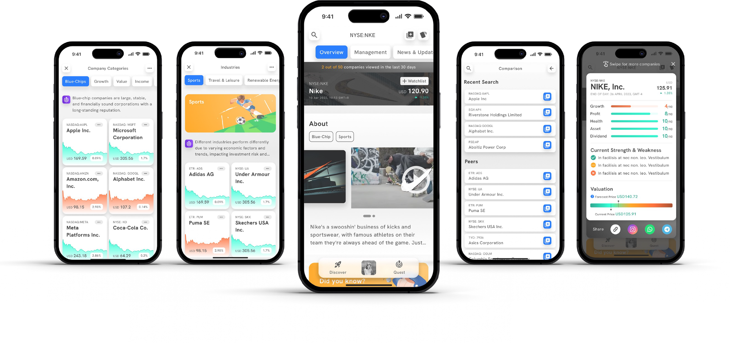
Top Navigation & Flashcards
A dynamic nav bar and flashcard-style summaries give users quick access to:
Overall performance
Stock comparisons
Similar companies
Watchlist functionality
Shareable snapshots for social and peer discussion

Humanized Management View
We replaced generic company bios with management team profiles, including photos, tenure, ownership stats, and LinkedIn links. This visual focus makes company leadership more relatable and easier to reference in discussions.
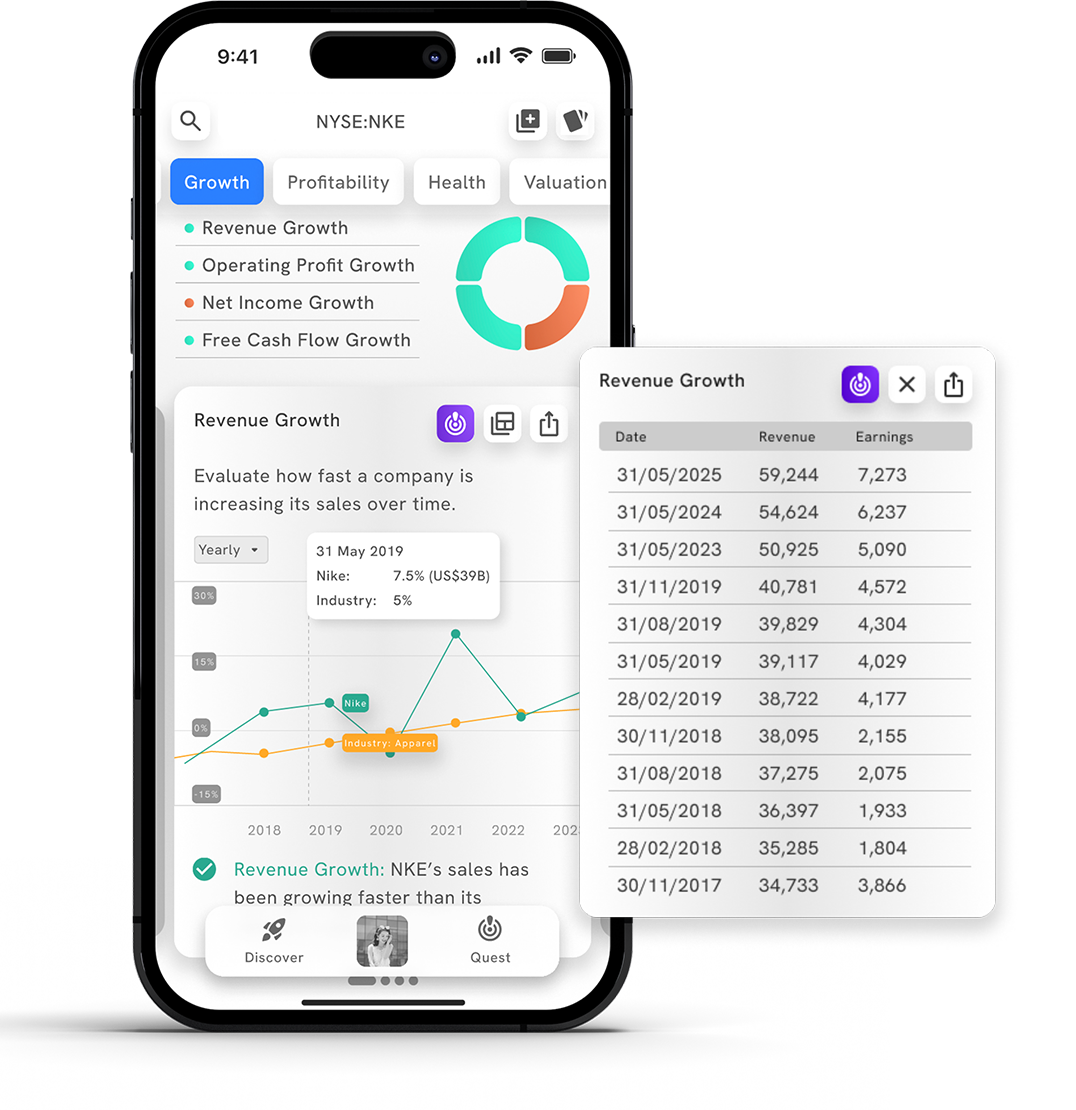
Interactive Learning on Charts
Tappable learning icons explain key metrics in plain language
Table view toggles let advanced users dig into raw data
Quick notes below each chart help all users grasp meaning at a glance
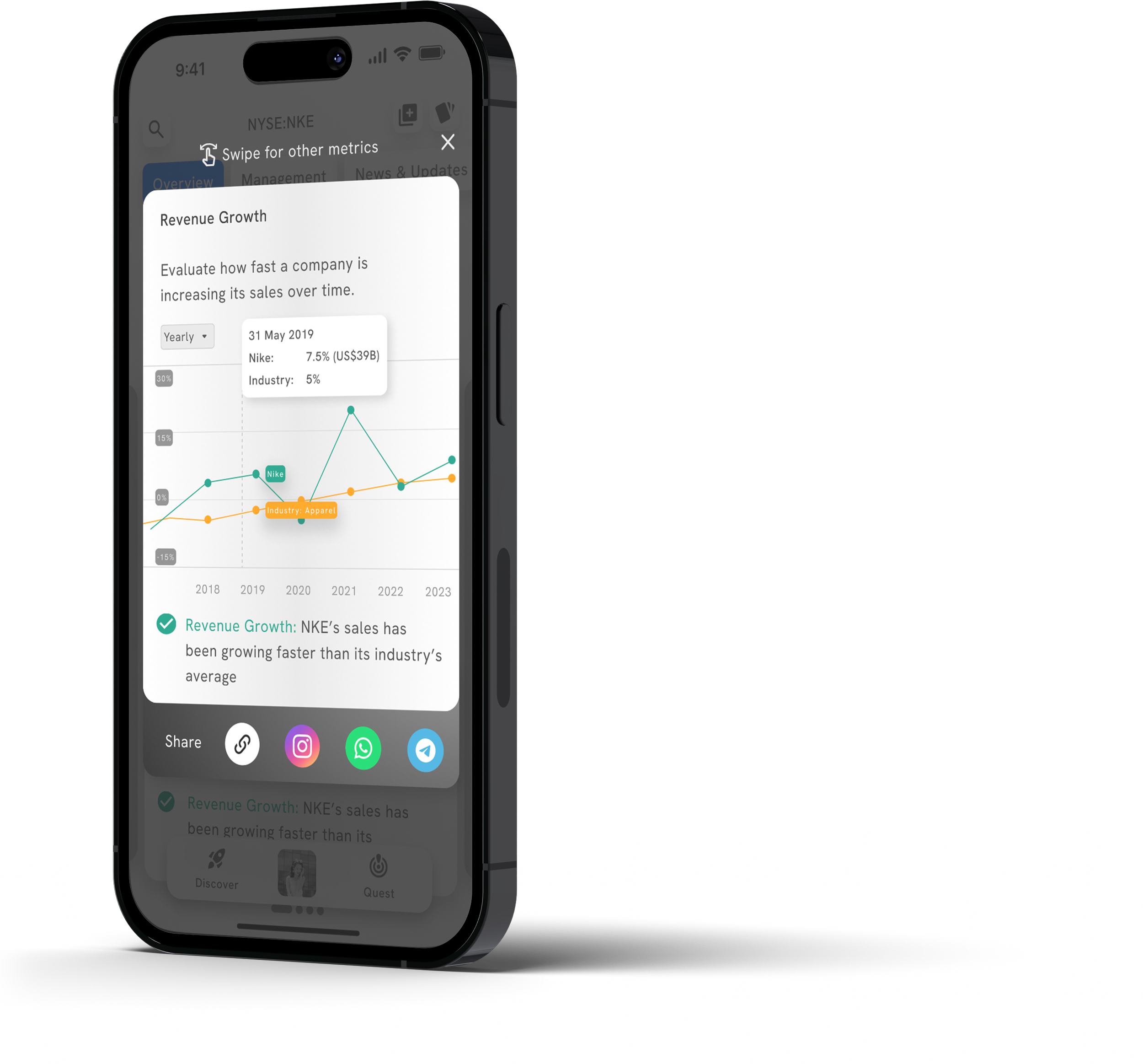
Social Sharing
Each chart and data point is shareable across platforms, helping users engage friends and communities in their investing journey.

News Contextualization
News events are now marked on the price performance chart, color-coded by impact (positive, neutral, negative), helping users connect headlines to stock movement.

Metric Grouping & Color Accessibility
We categorized stock metrics (e.g., Growth, Health, Valuation) and designed color systems that are colorblind-accessible. Language and comparison points (e.g., vs. inflation) use everyday concepts to reduce the learning curve.
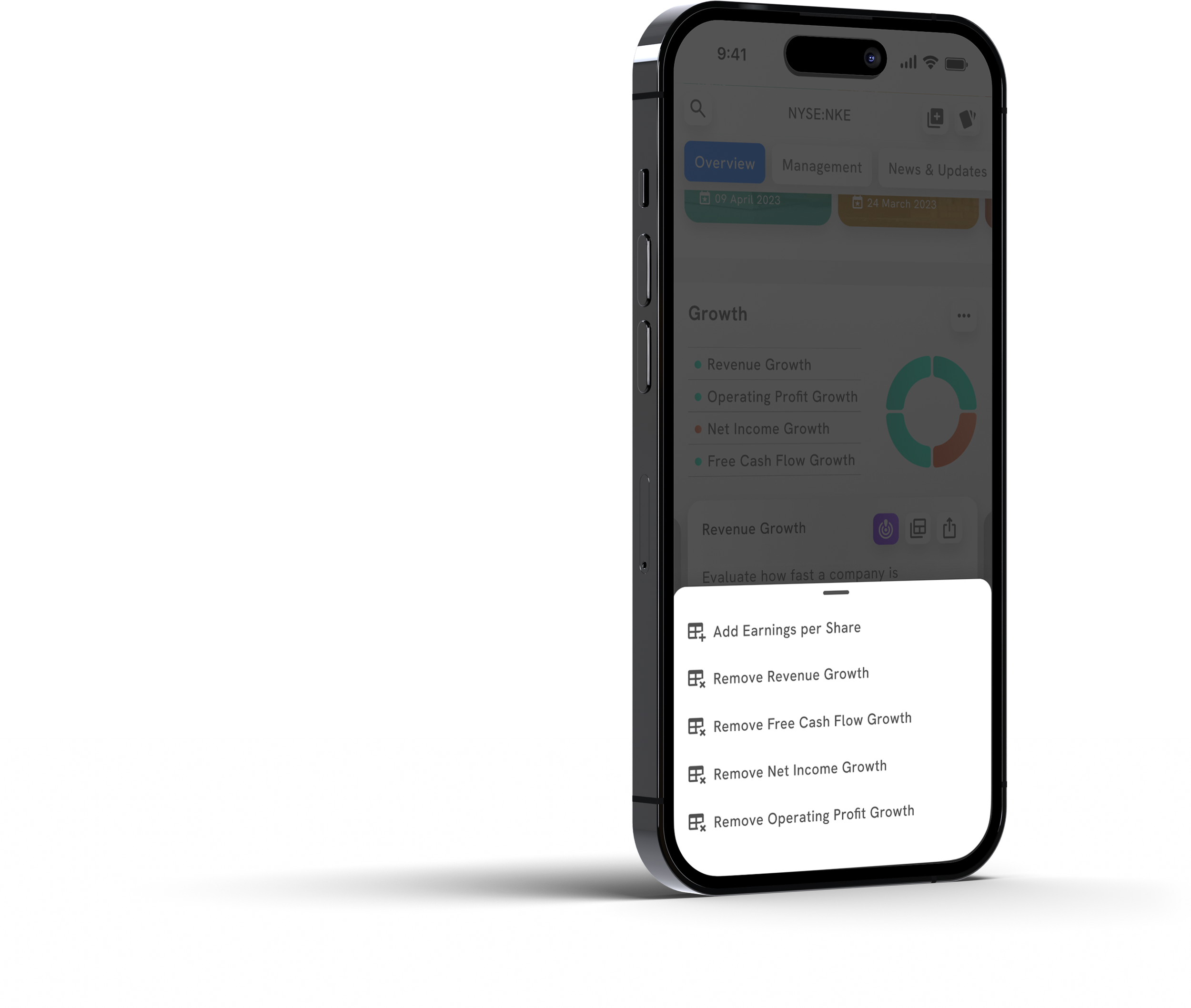
Personalization Layer
Users can add or remove metrics based on what they care about or want to learn, letting them grow with the product at their own pace.
Power for Pros
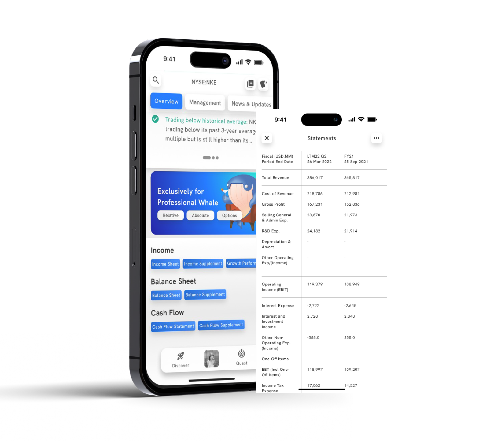
Experienced users still have access to full financial data, available at the bottom of the page without cluttering the main view.
What We’re Learning and How We’ll Measure Success
The new design was tested using Maze with 18 participants, revealing promising early results.
Key Learnings:
• 78% of users were able to interpret the data and make informed decisions about a stock
• Users found the shareable flashcards and charts highly engaging, especially when comparing companies
• Visualizing management and simplifying metrics made the experience feel less intimidating and more conversational
Success Metrics (Post-Launch Goals):
• Engagement time on ticker pages (scroll depth, interaction with nav and charts)
• Feature usage of personalization, chart sharing, and comparison tools
• Reduction in early bounce among first-time users exploring tickers
• Increased watchlist adds and peer shares from redesigned elements
• Surveyed confidence scores in understanding stock metrics
Conclusion
The revamped ticker module transforms stock exploration from a dense, data-heavy task into a narrative-driven, approachable experience. It invites users, regardless of experience level to engage, learn, and share their investment journey.
By humanizing financial data, simplifying access to insights, and enabling conversation, we’ve taken a crucial step toward making stock investing social, intuitive, and inclusive.